Mirror

Mirror is a global clothing store with a range of styles (casual, business, formal, etc.) looking to launch their rebrand and digital transformation. Their consumers have given them feedback indicating they expect a more modern approach and would prefer the convenience of shopping online.
My role
Research, Information Architecture, User Flows, Sketching, Wireframing, UI Design, Prototyping, Testing
Timeline
8 weeks
The challenge
Design a brand for the company that is modern and neutral enough to attract a wide range of consumers and styles. Create a responsive website that allows users to browse effortlessly across devices (desktop, tablet, mobile).
Key goals
Develop a clean and modern brand system.
Design a seamless experience across devices.
Identify patterns in shopping behaviors for optimization.
My process
Discovery
User interviews
User surveys
Persona
Emapthy map
Define
Project goals
Feature roadmap
Info. architecture
Task/user flows
Product reqs
Ideation
Wireframes
Mood board
Logo development
Brand style tile
Prototype
Mid-fidelity prototype
Validation
Usability testing
Affinity mapping
Documentation
UI kit
Design specs
Discovery
I wanted to learn how people browse and purchase clothing online. I conducted 5 interviews with potential users in the tri-state area and an online survey with 20 participants from all over the world. The interviews allowed me to get a deeper understanding of common online shopping patterns, and the survey helped test those insights at a larger scale. The main takeaways from the two methods were:
01
Throughout the day, participants shop as time allows, even when they’re at work. This often means using their phones.
02
Fit can be the difference between a good experience or a bad one. 4/5 people interviewed said they often reordered what fit.
03
Free shipping and flexible return policies are necessary. Worst case scenario is a bad fit + bad return policy.
04
Menu items and filters are the main navigation tools. Not one participant used the search field, even when prompted to “search.”
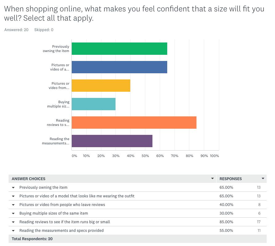
Screenshot of the survey results for one of the questions related to shopper confidence.
The survey validated patterns seen in the interview data:
50% of shoppers say a return policy is Very or Extremely important in their decision making
The majority of shoppers are buying clothes somewhat to extremely often.
Reading reviews is the #1 method shoppers use to feel confident about a purchase. Photos/videos or previously owning the item are tied for a close second.
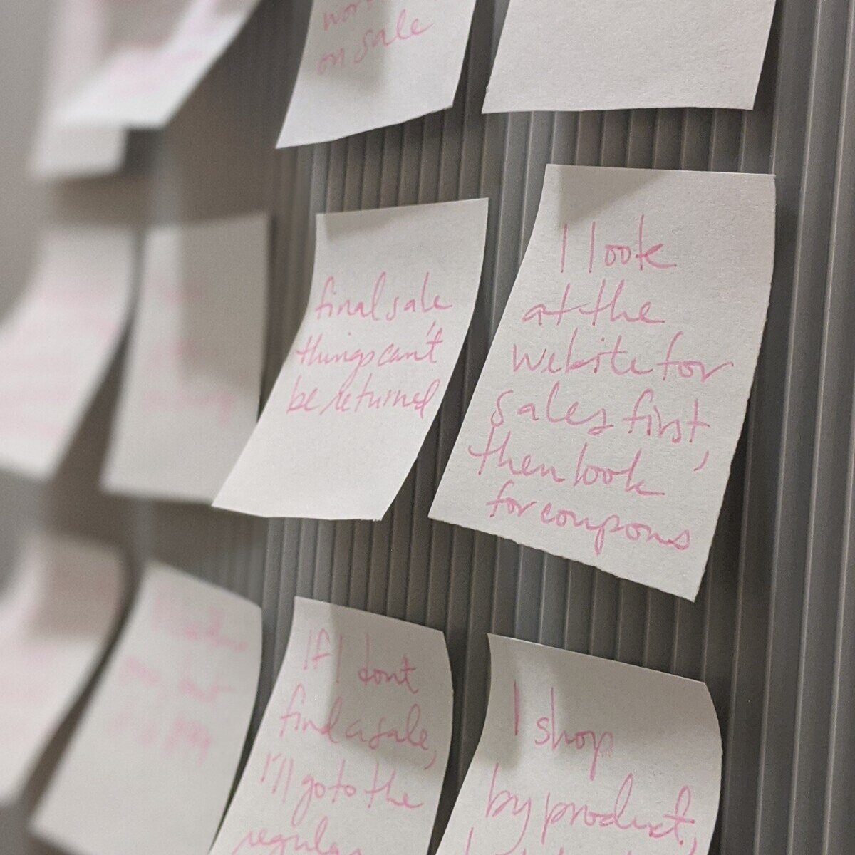
I grouped the feedback into categories and started looking for patterns.
Meet Gina
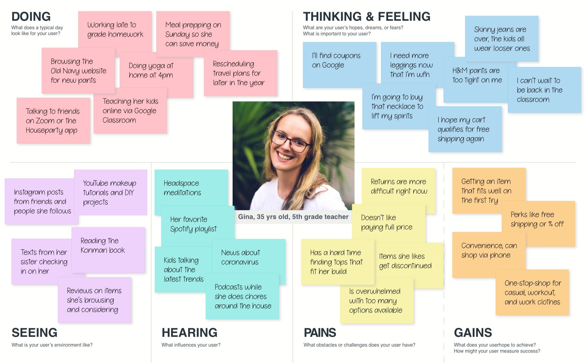
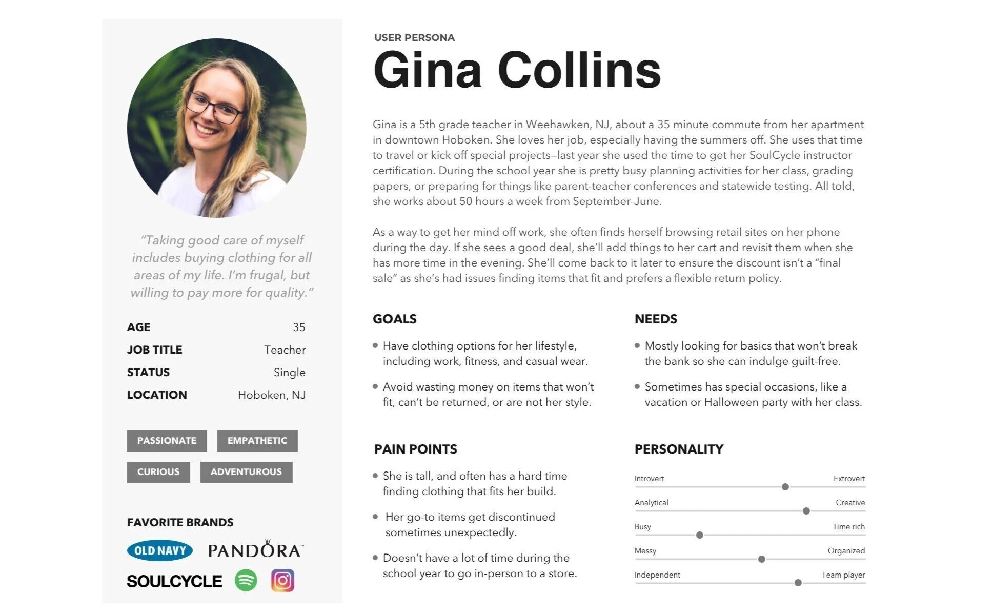
I used the findings to construct a persona named Gina. An empathy map helped define what Gina was seeing, hearing, doing, thinking, and feeling while shopping. I also mapped out her goals and pain points to better understand the opportunities to design for her needs.
Define
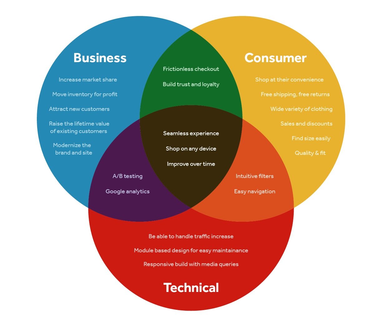
Now that we had a persona, it was time to start defining the project to ensure alignment. Taking the time to map out business, consumer, and technical considerations helped prioritize items in the feature roadmap.
Feature roadmap
Click on the thumbnails below to see the features roadmap. The original spreadsheet is available here.
Information architecture
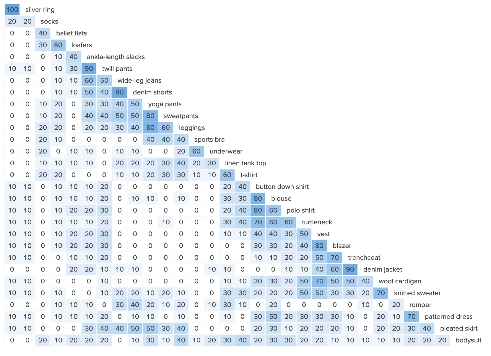
After identifying the major features of the site, I set out to make decisions on the organization and navigation on the site. To dig a bit deeper, I turned to OptimalSort for a card sorting study. Users in Mirror’s target demographic were provided 30 cards containing various clothing items to categorize.
The groupings were pretty evenly split between participants choosing where clothing was on the body (i.e. tops, bottoms, shoes) and context in which the items were worn (work, gym, casual). Some of the trending groupings included Tops (8), Underwear (8), Accessories (7), and Casual/Comfy (6). Coats, Jackets and Outerwear all made an appearance. I was hoping to narrow that down to one phrase, but instead ensured they were considered as synonyms for the search function.
Something I wasn’t expecting to see was multiple entries for Everyday as a synonym of Casual. I kept that in mind for possible look book content on the site.
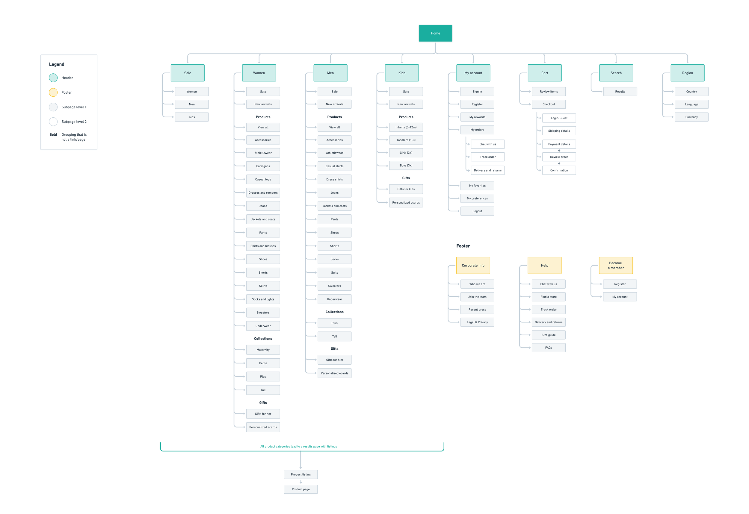
I took a fresh look at my competitive analysis, interview notes, and integrated the new card sorting results. A site map helped pull all of the details I needed to think through before moving on to wireframes.
Rough sketches
Next, I wanted to start generating ideas for the features and visual design for the homepage. I did a lot of exploration here to figure out which approach made the most sense. Ultimately, I ended up editing options from the various approaches together when I moved on to mid-fidelity wireframes. I prefer to do this kind of exploration in sketches—I find it is more efficient than going straight to digital tools.
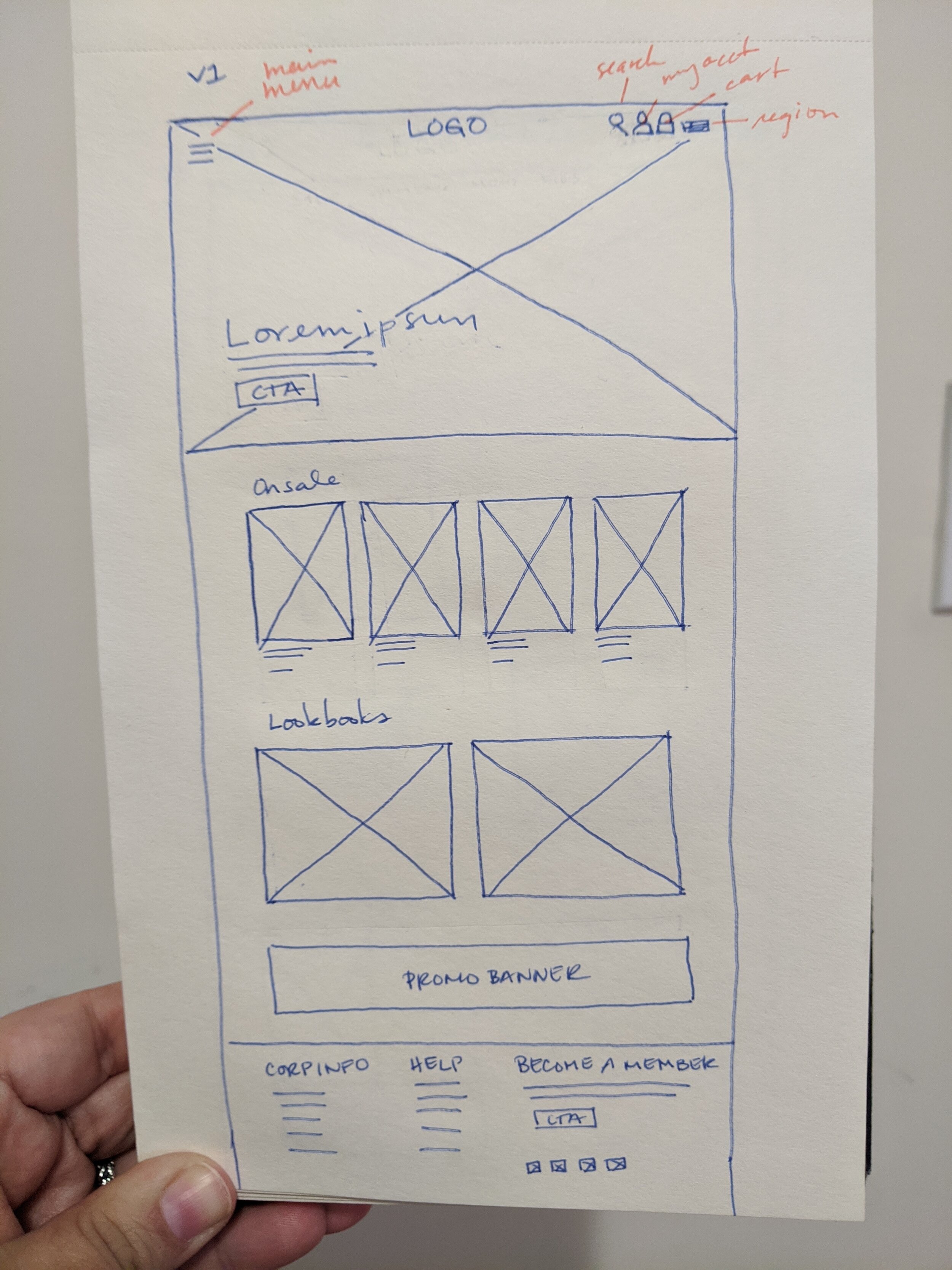
This approach uses a full-bleed hero and highlights products
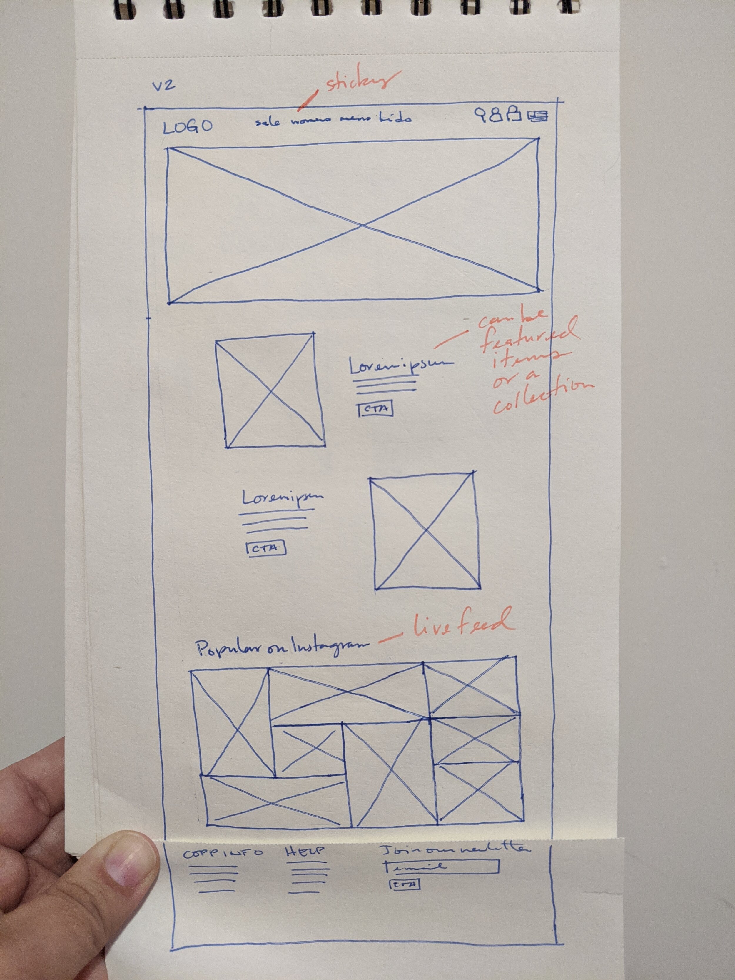
This approach focused more on content features
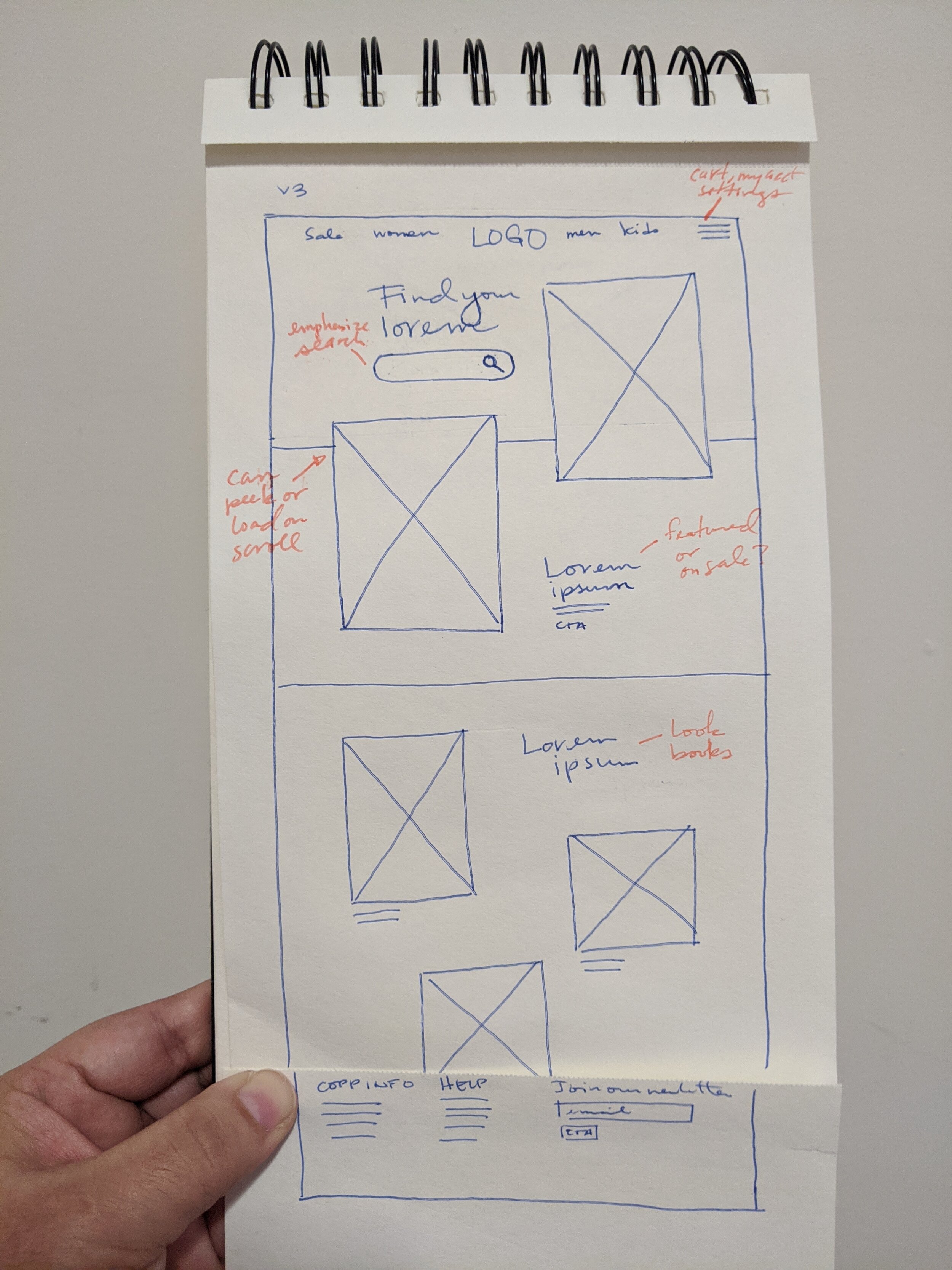
Elevating search seemed interesting, but was ultimately scrapped
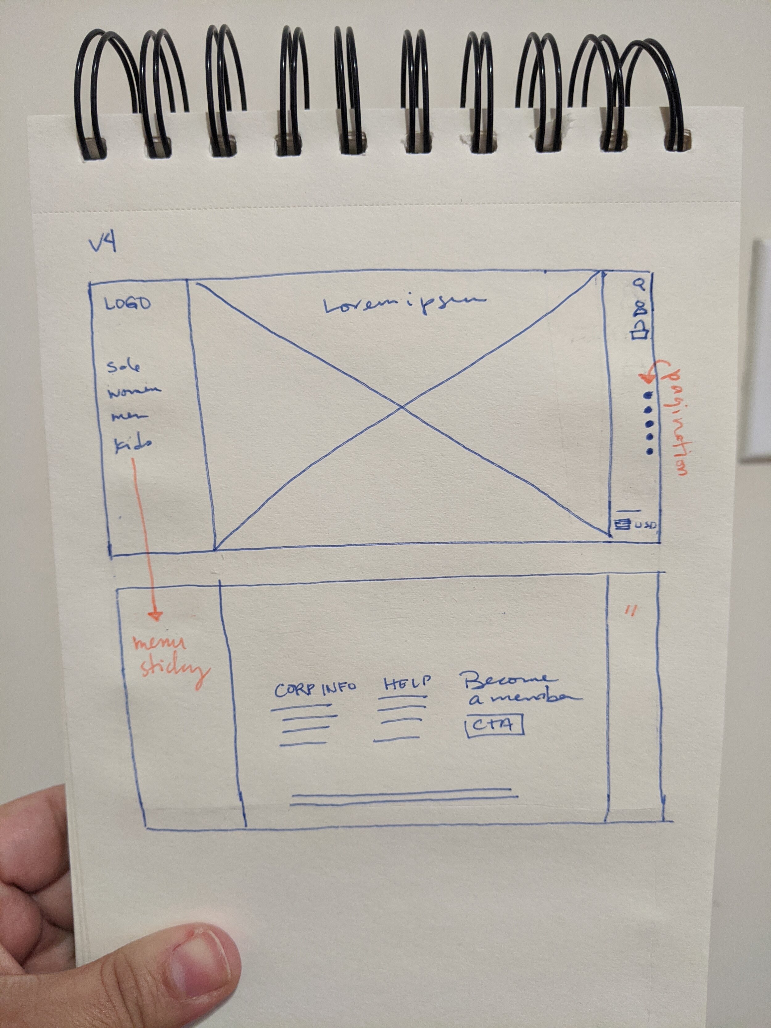
A completely different exploration with a sticky sidebar
Task flow
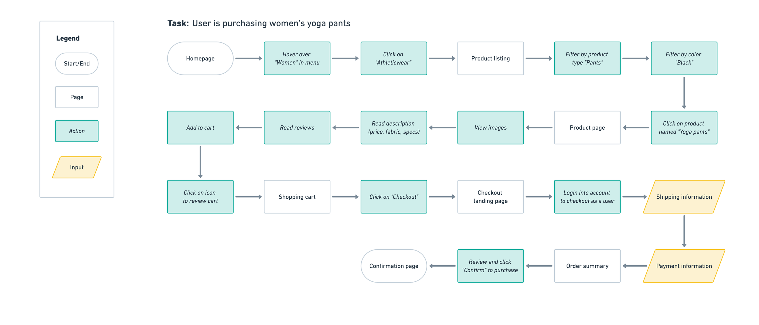
I identified the key screens to be designed by using the main flow to complete a purchase. I kept this abstract to avoid getting too caught up in small details at this stage. The idea was to map the happy path for the task of buying a pair of women’s yoga pants.
User flows
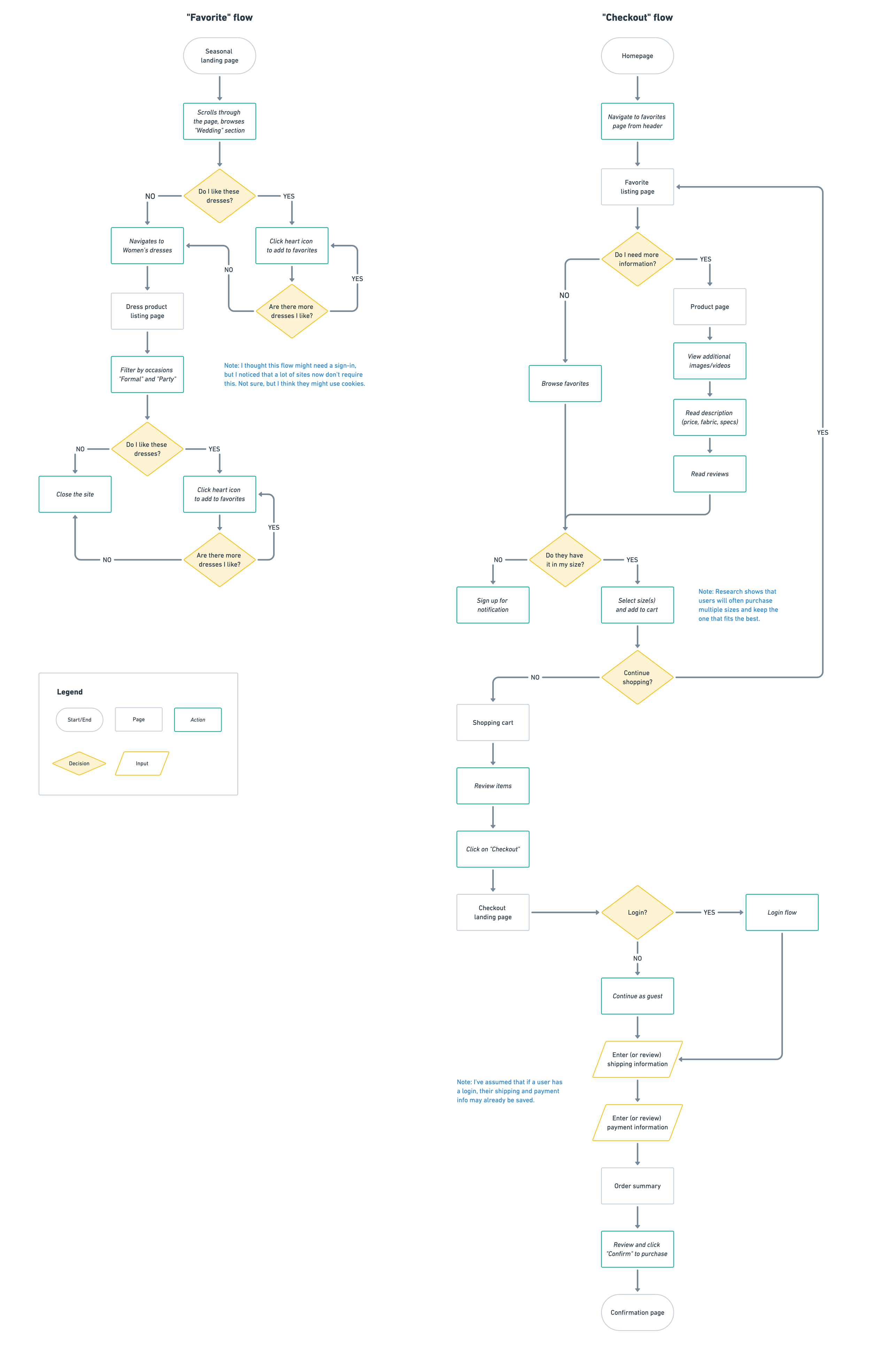
The user flows were an opportunity to go deeper into the user needs. My research showed that a common behavior was browsing items during breaks during the day, favoriting them, and then returning to that list to purchase at a later time. I wanted to frame this for our persona, Gina:
Context and user goal
Gina was invited to a friend’s wedding in June. While on a break at work, she goes to the Mirror site to browse dresses for the occasion.
Her goal is to save items she is interested in so that she can review them later on when she has more time to look at the details, like product images and reviews.
How she gets to the site
Gina received an email that morning from Mirror that promoted dresses for the season. She clicks the CTA to explore our selection and save some dresses to her favorites.
In the second flow, she’s come back to her list to purchase a dress from the favorites list.
Product requirements
The task and user flows informed which pages to design. Click on the thumbnail to see the full product requirements.
Homepage
Category page
Product details page
Search results
Shopping cart
Checkout
Ideation
At this point I now had enough information to move on to wireframes. Since the site is going to be responsive, I made versions for desktop, tablet and mobile.
Homepage wireframes
Category page wireframes
Product page wireframes
Mood board
Next, to help build a foundation for the new brand, I created a mood board. I wanted Mirror to feel fashion-forward without alienating the mass market.
I decided to walk that line by balancing elements like display type and a palette that are more sophisticated with body copy and icons that are more practical. Click the thumbnail to view the Pinterest board.
Logo development
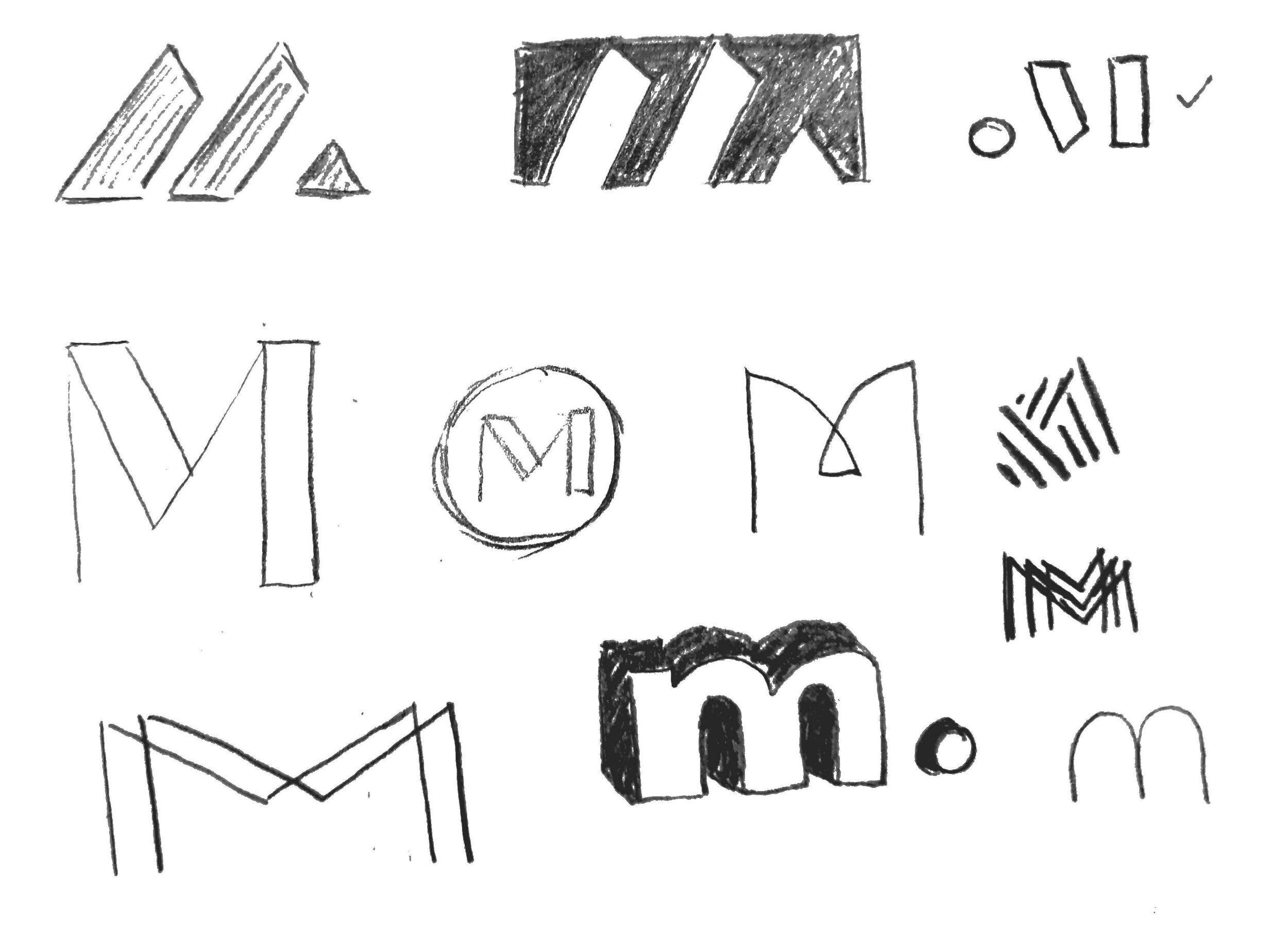
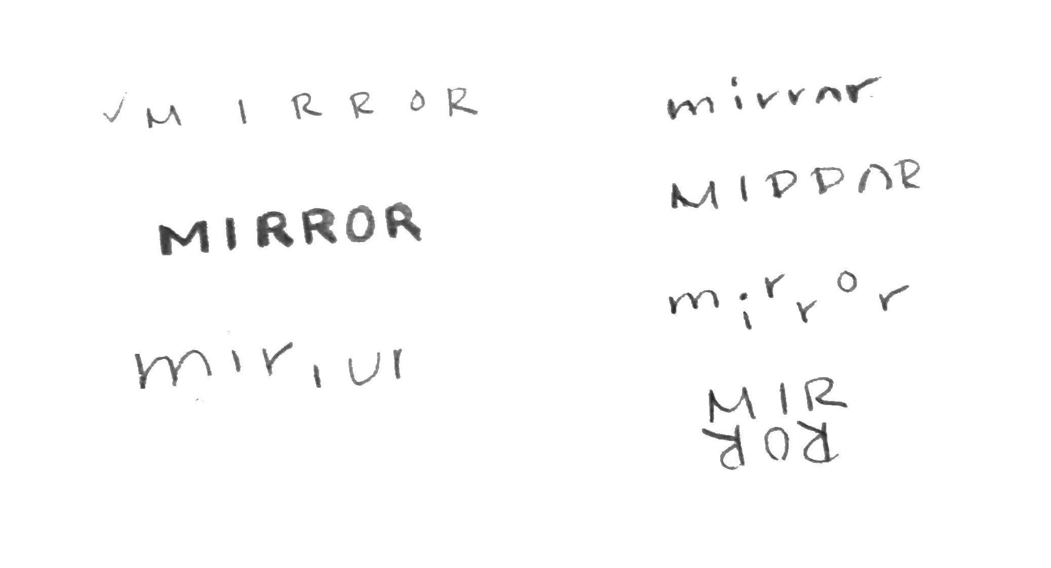
With the mood board in mind, I hand drew some logo sketches to explore options.
I did research to see what established fashion brands use as marks, and saw that there were a lot of monograms. I liked the idea of deconstructing the M in mirror into something bold that could have quick recognition. The sketch I liked best in this grouping is checked off.
Another trend in fashion is hand lettering or script for the logo. I’ve done a bit of amateur calligraphy, so this was an interesting angle for me. I like the form of the lowercase m, but it might be too feminine for Mirror.
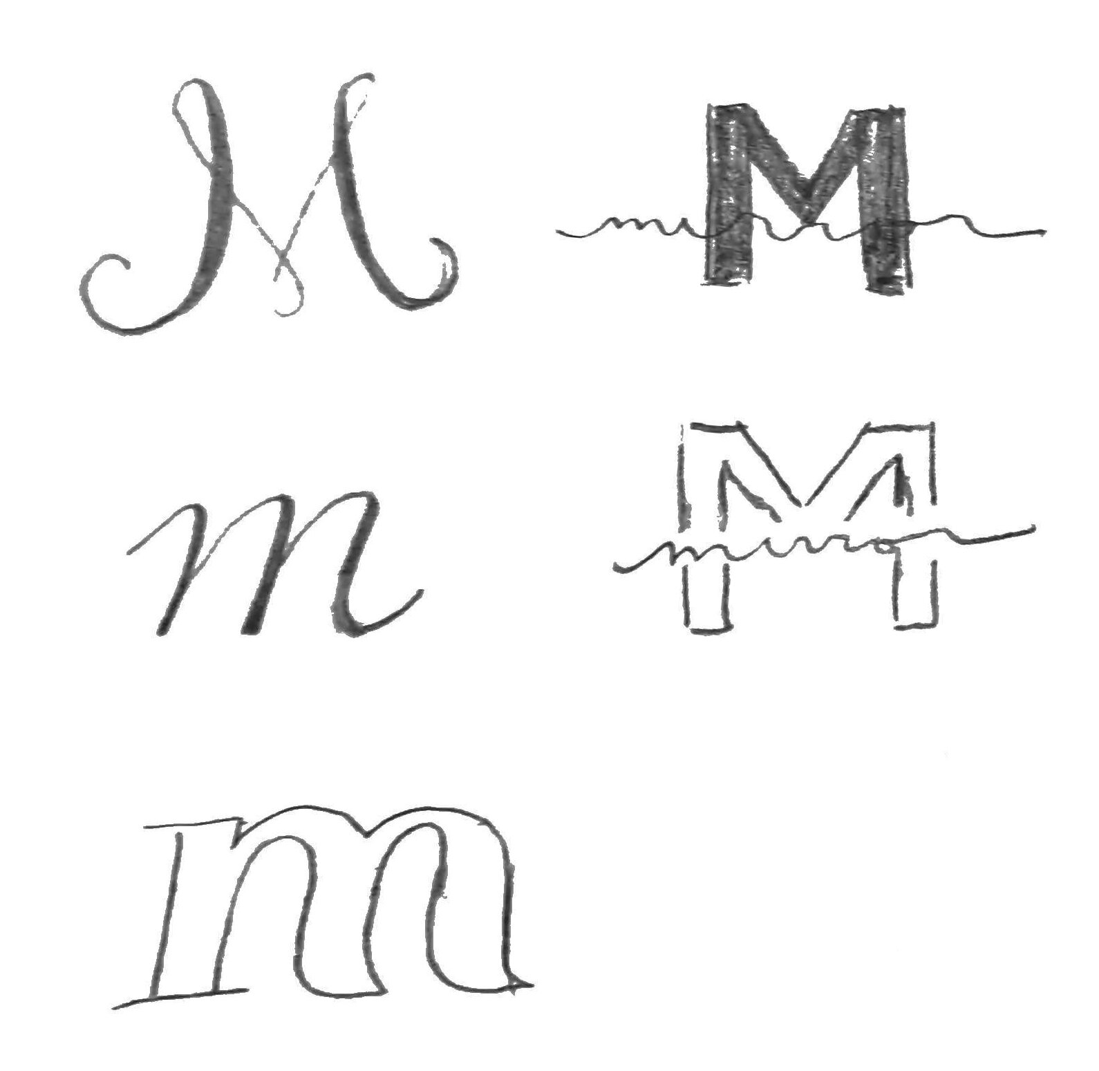
Tracked out type is another fashion staple, so I tried that. I explored a bit with cutting the type off at the bottom, which I thought would work well beyond digital for printed items like shopping bags.
Refined sketches
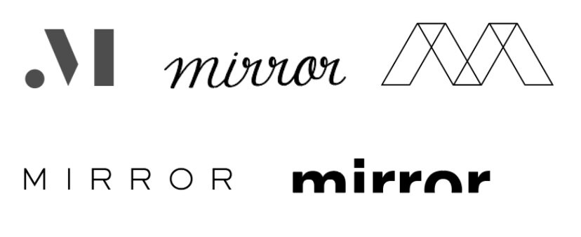
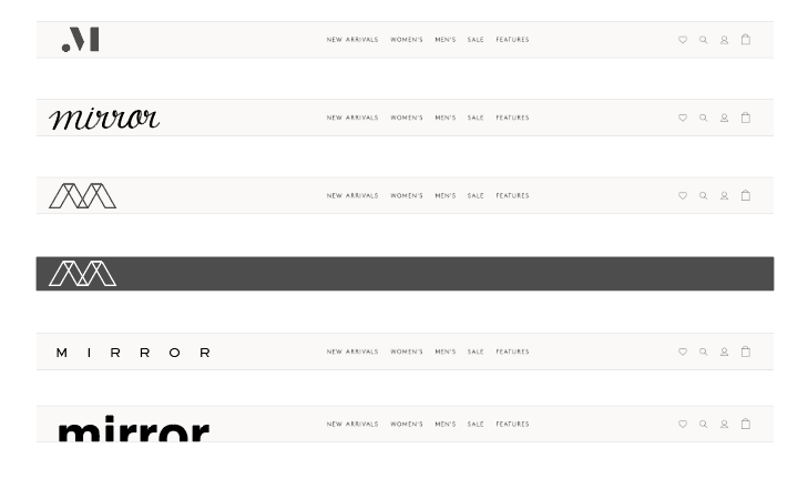
I brought the finalists into Illustrator and polished them into digital sketches. I also placed them in a mockup of a nav to see which ones worked the best:
Brand style tile
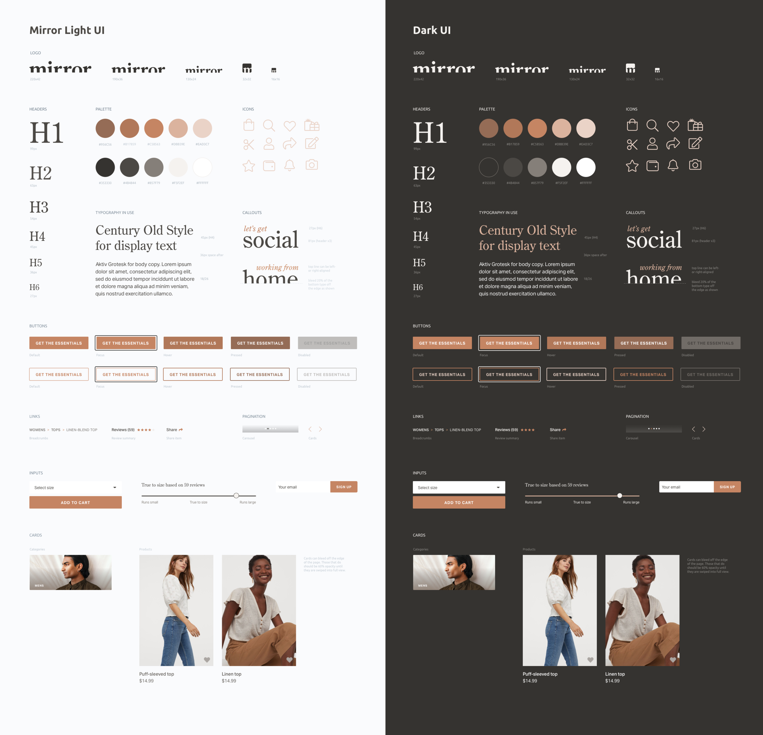
A final refinement of the logo resulted in using the cut off type in a humanist typeface, Century Old Style. Pairing that with a sophisticated, muted and neutral palette helped bring the brand to life:
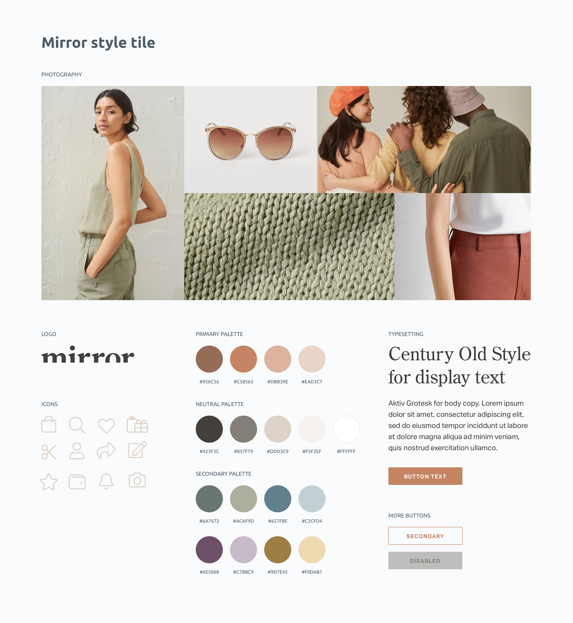
The palette was eventually edited down to just the primary and neutral palettes.
Prototype
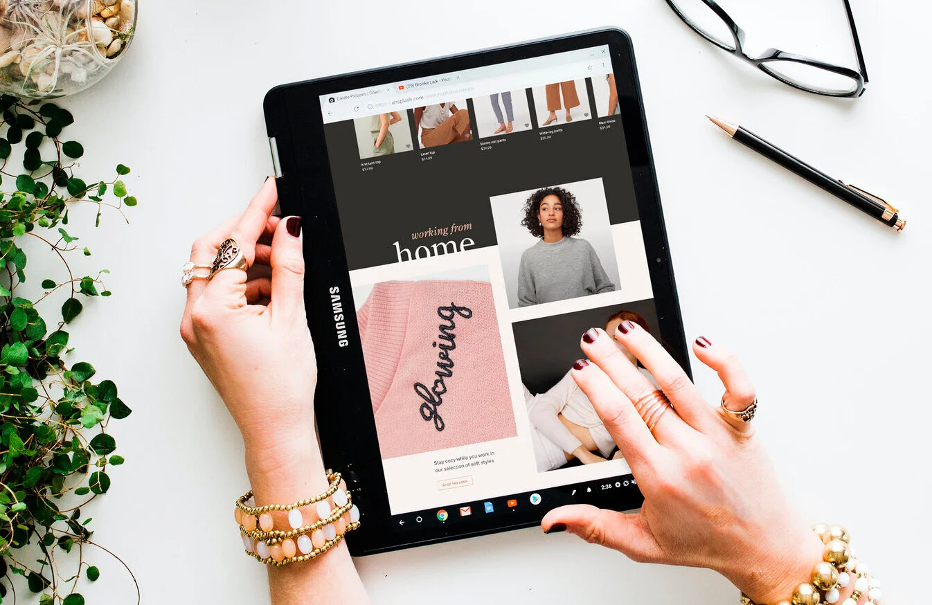
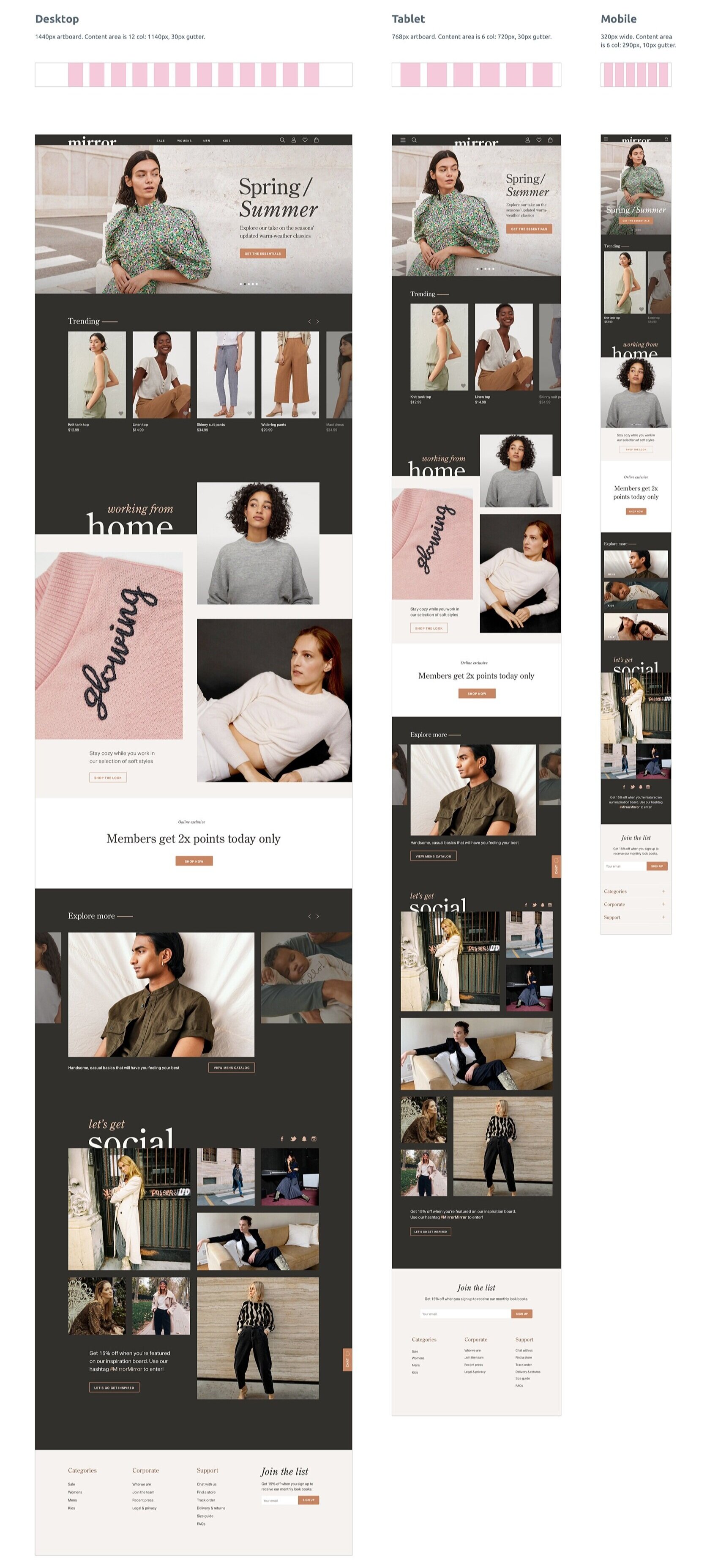
I really enjoyed how all of the previous steps came together in building the UI.
Validation
Now that I had a working prototype, it was time to see how real users would interact with it.
User testing
I tested the Mirror prototype with 8 users: 5 on Usability Hub, 2 via Zoom, and 1 in-person. There were 3 scenarios with various associated tasks—browsing and adding to favorites, adding an item to their cart for checkout, and reaching out to customer support to correct an error with their order.
The goals were to:
test the overall ease of use of the design
test product page hierarchy to see if users have the right information when it is relevant
see if the checkout flow was intuitive
discover any opportunities for improvement.
Affinity mapping
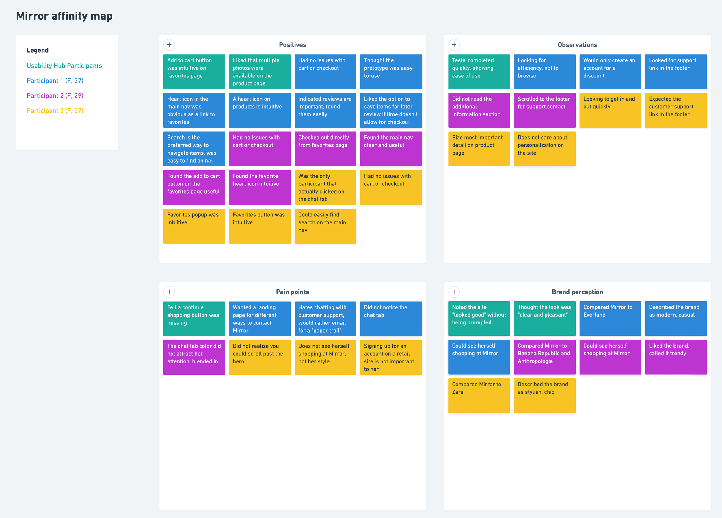
I had great feedback that helped me think about the usability of some features. I organized my findings in an affinity map to identify the pain points and potential solutions for future iterations. The biggest insight was that the sticky chat popup was not intuitive for customer support. Users were expecting it to be a different color or a simple link in the footer, and had feedback on preferred methods of contacting a retail company.
Documentation
After testing, I updated the existing UI kit and uploaded the project Sketch file to InVision Inspect for dev handoff.
